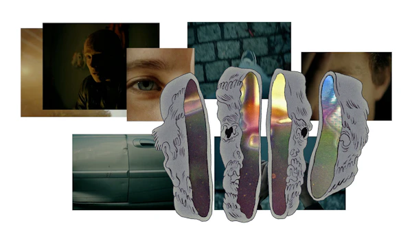
Snøhetta bak ny Grette-profil
Advokatfirmaet Grette har fått ny visuell identitet.
Aktuelt byrå

Snøhetta Design
Snøhetta has developed a new visual identity for the corporate law firm, Grette. The visual identity is based on the concept of interplay – a concept echoing the firm's work methodology and philosophy. It reflects how Grette's lawyers and other members of staff interact to move towards a common goal, and highlights the firm's client approach.
More than being a simple advisor, Grette aims to give legal advice based on deliberative dialogue. Recognizing each individual employee, their efforts, specificities and strengths lies at the core of how Grette tailors holistic teams that can take on complex legal assignments within a wide range of disciplines – be it within corporate transactions, intellectual property or the commercial real estate industry. The sense of collective effort and respect for individuality were strong design premises when developing Grette's new visual identity.
Individuality and Collectiveness
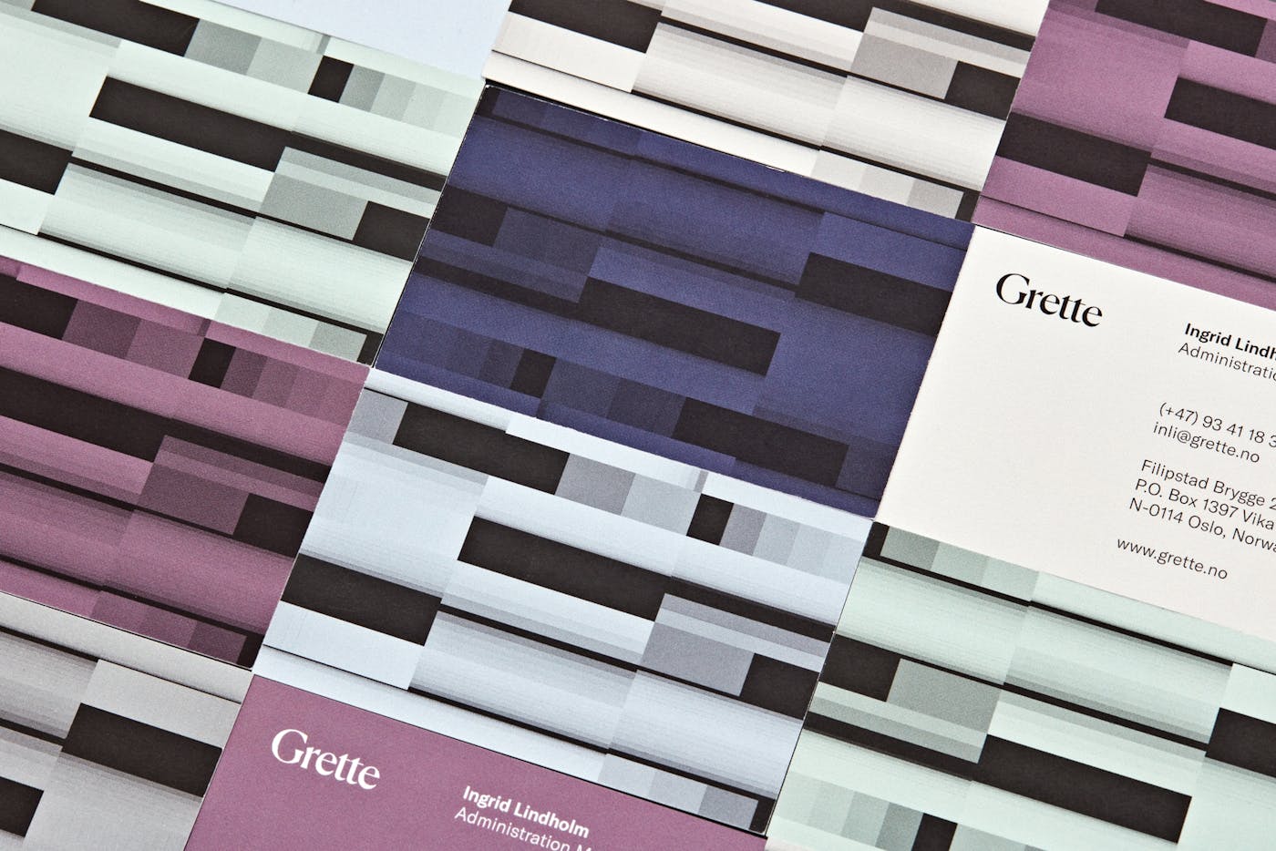
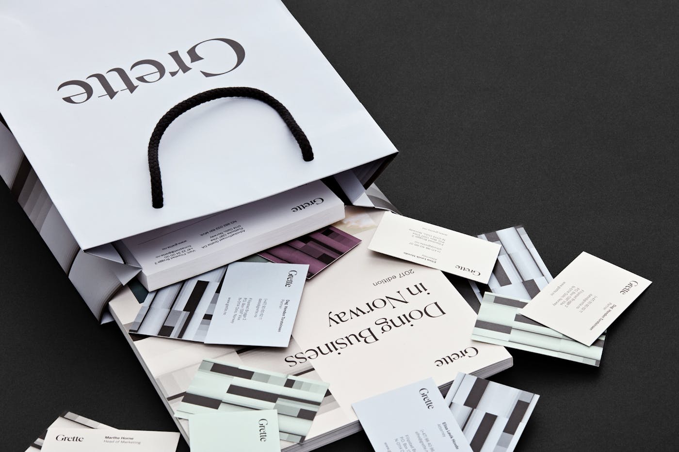
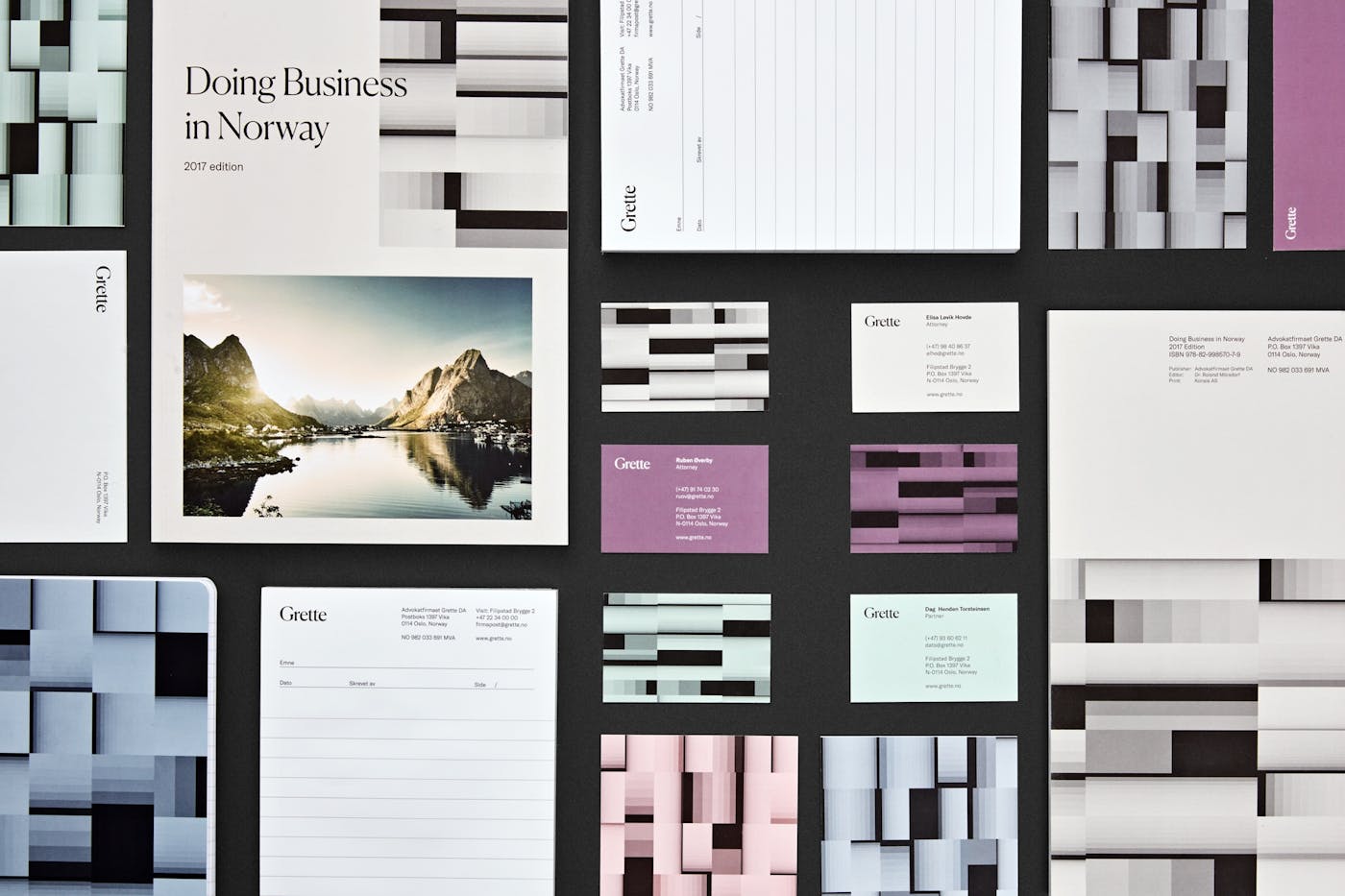
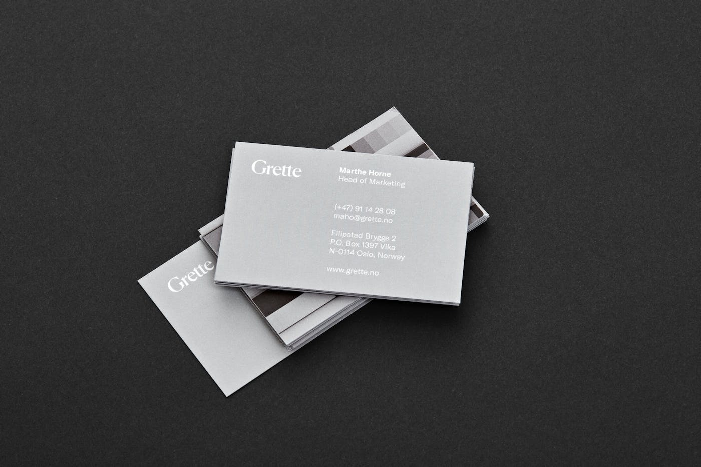
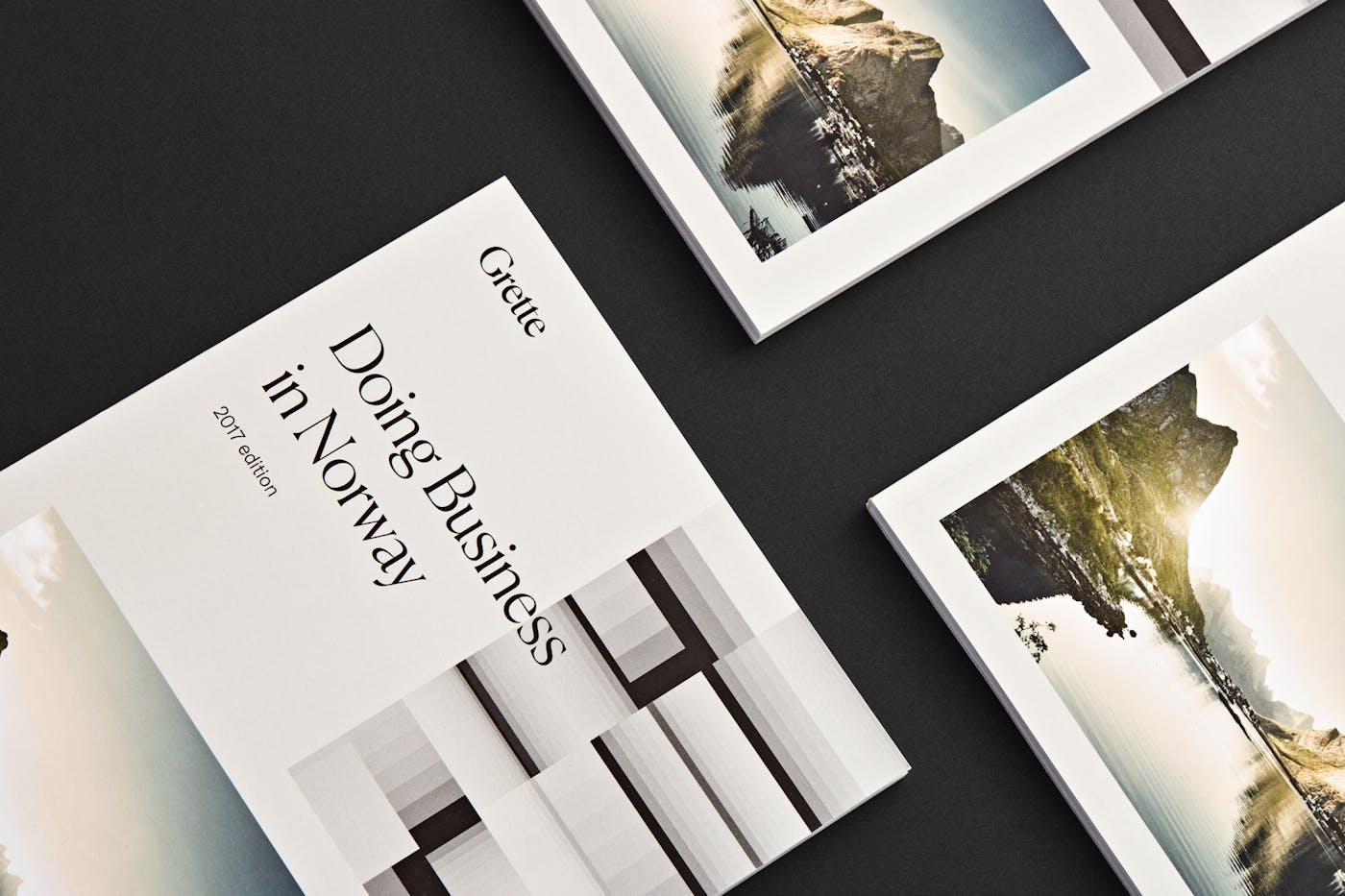
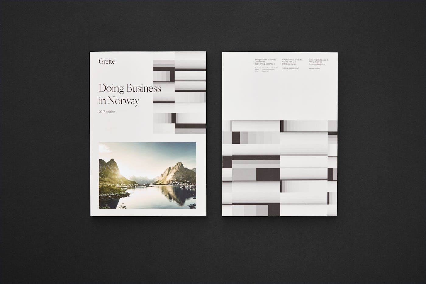
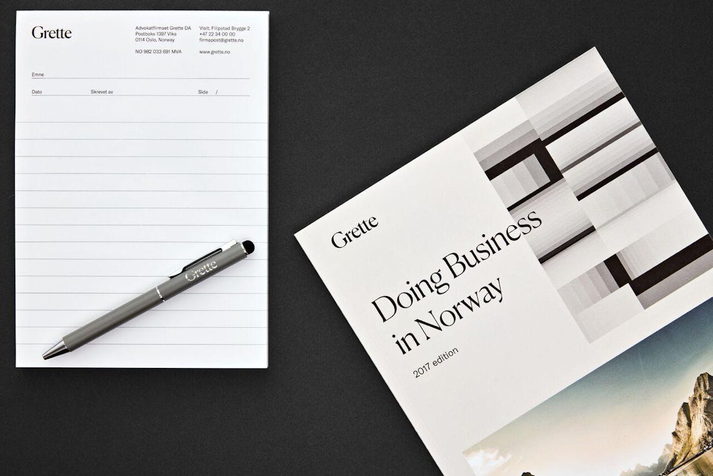
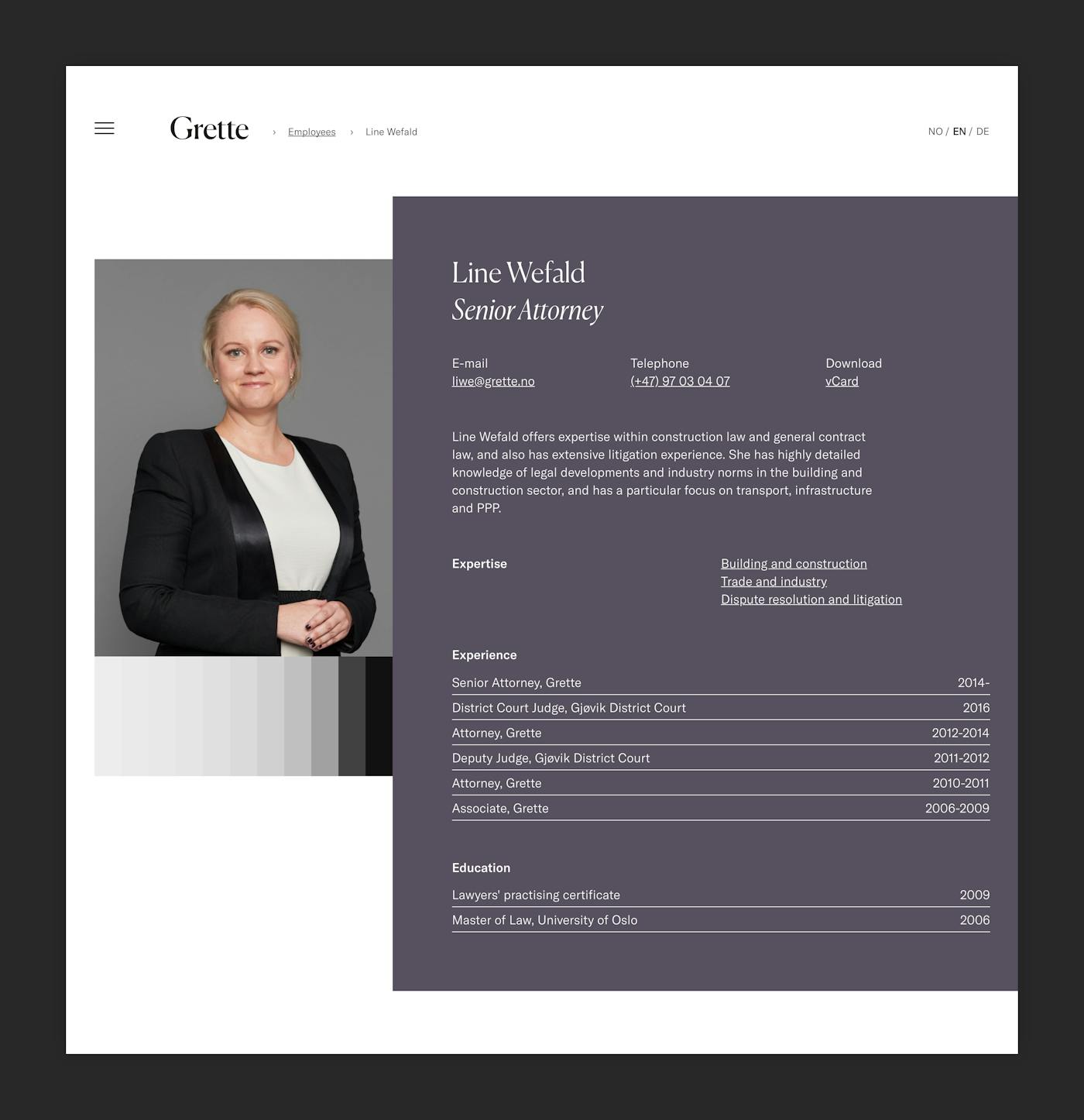
Snøhetta developed a visualization tool that responds to different sets of employee characteristics, where experience is the strongest influencing parameter. Other parameters, such as title and name, are also taken into account. The output from these parameters is a constellation of quadratic shapes in sequential shades of grey, designed to blend into an underlying color.
Whereas characteristics such as title will generate a certain grey scale, the length of the person’s name will influence whether the gradient is structured horizontally or vertically. Individually, the shapes symbolize each employee's unique characteristics. Put together, the shapes reflect a set of skills, a complex pattern of experiences and characteristics making up the uniqueness in each legal team.
This visualization tool is accessible from Grette's digital design manual. In this manual, Grette can generate new patterns on the fly based on specific team constellations and across departments.
Logo and Typography
Grette's new logo is purely typographical, utilizing the well-established Grette name and legacy. Playing with the characteristics of two classical typography styles, the logo manifests the concept of interplay.
The typographic palette also includes a sans-serif that represents an interplay between European grotesques and American gothic typefaces. The different typographies can be used interchangeably or isolated – again echoing an idea of individuality and collectiveness.
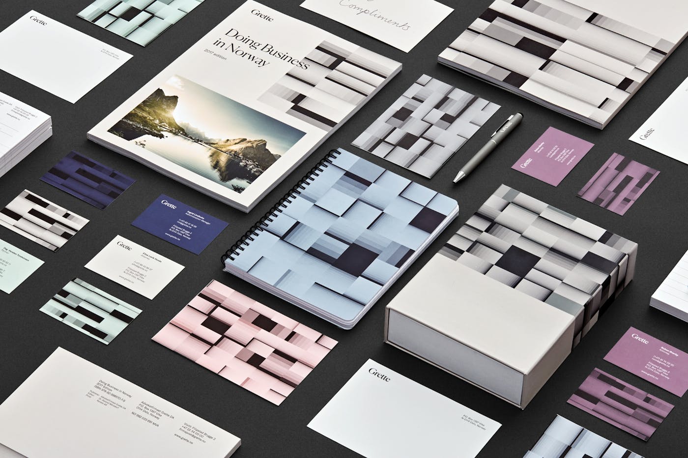
Color Palette and Printed Material
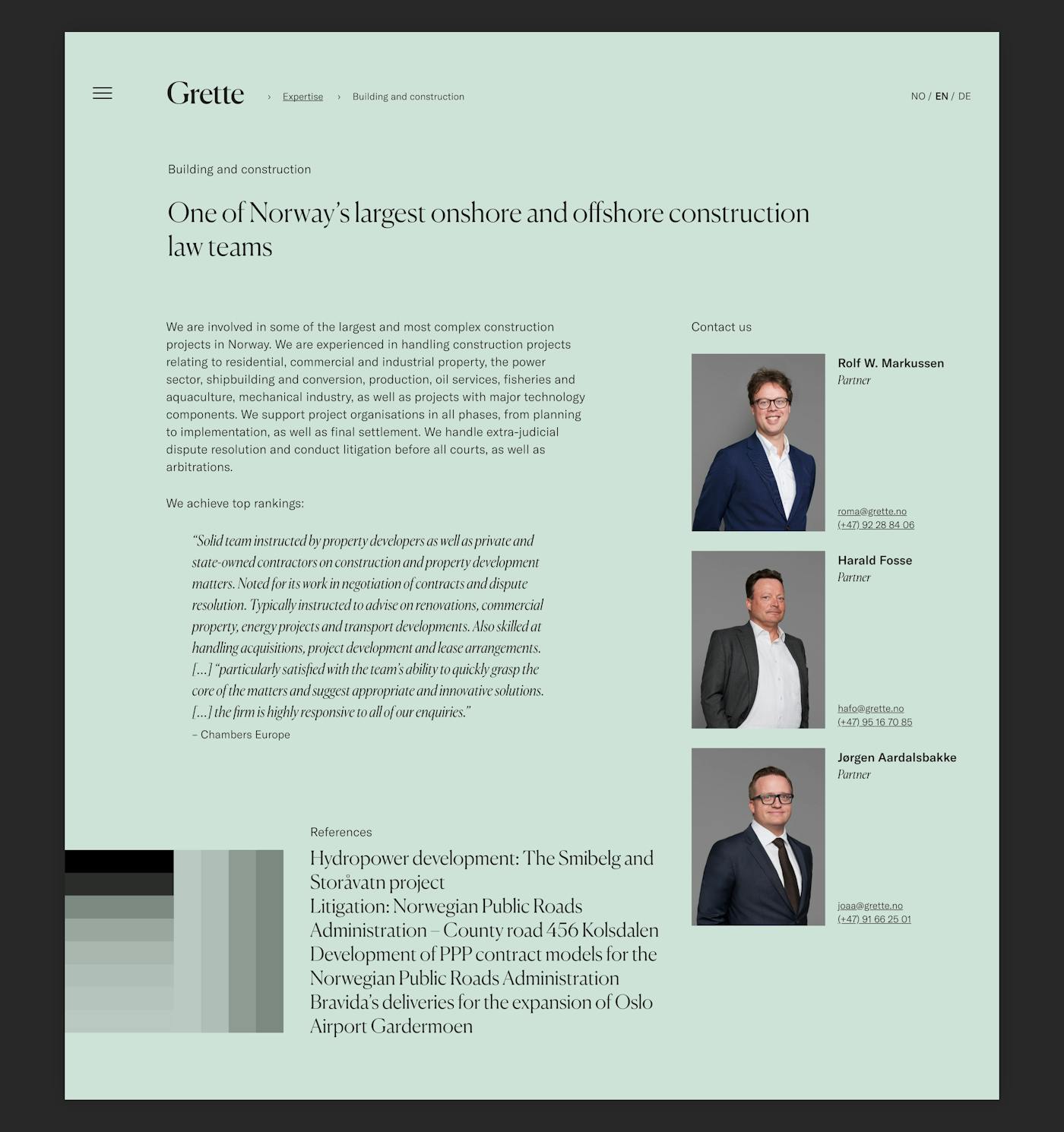
A subdued and elegant color palette is applied throughout the different elements composing the visual identity. Typography and logo are composed of both neutral colors such as black, grey and white. For printed material, an equal number of warm and cold colors are available, ranging from subdued shades of burgundy, aubergine, blue, green, a warm grey tone, or pink.
Moreover, Snøhetta has developed an extensive kit of templates and guidelines for printed materials such as business cards, brochures, folders and other official documents.
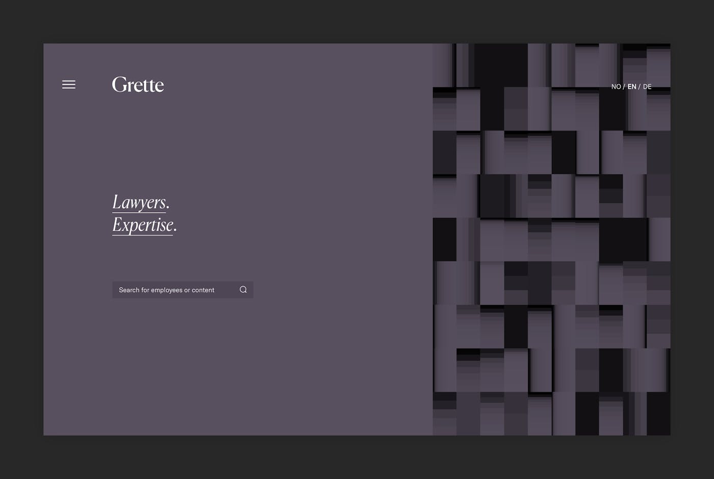
Employees and Expertise. In Real Time.
In close collaboration with Kodebyraaet, Snøhetta has created Grette's new online home where all the graphical elements and design principles from the design manual are applied.
With strict priorities in content, the site showcases Grette’s expertise and highlights the strong duality between individual skill sets and collective efforts. This is reflected by the site's home page, where the characteristic, interactive pattern is generated in real time as new employees join the team and employees gain seniority.