Typografens kudos
Denne ukens kudos kommer fra grafisk designer Ellmer Stefan. Han tar oss med inn i typografiens verden.

studerte grafisk design i Wien, Arnheim og Leipzig, med en stadig økende slagside mot typografi og skrifttypedesign. Vi lar ham fortelle videre på engelsk.
– After successfully abandoning my academic studies and a personal encounter with one of my heros in the field (namely F. Smeijers) I moved to Norway in 2010. Since 2011 I run an independent practice combining teaching, historical and semiotic research, self-initiated projects (such as the infamous Pyte Foundry) and custom work in the fields of lettering and type design.
– Mille Grazie goes to Erika and Henrik for passing the baton; I will do my best to live up to the expectations, and run.
Fortell om én eller flere norskproduserte jobber du er glad i.
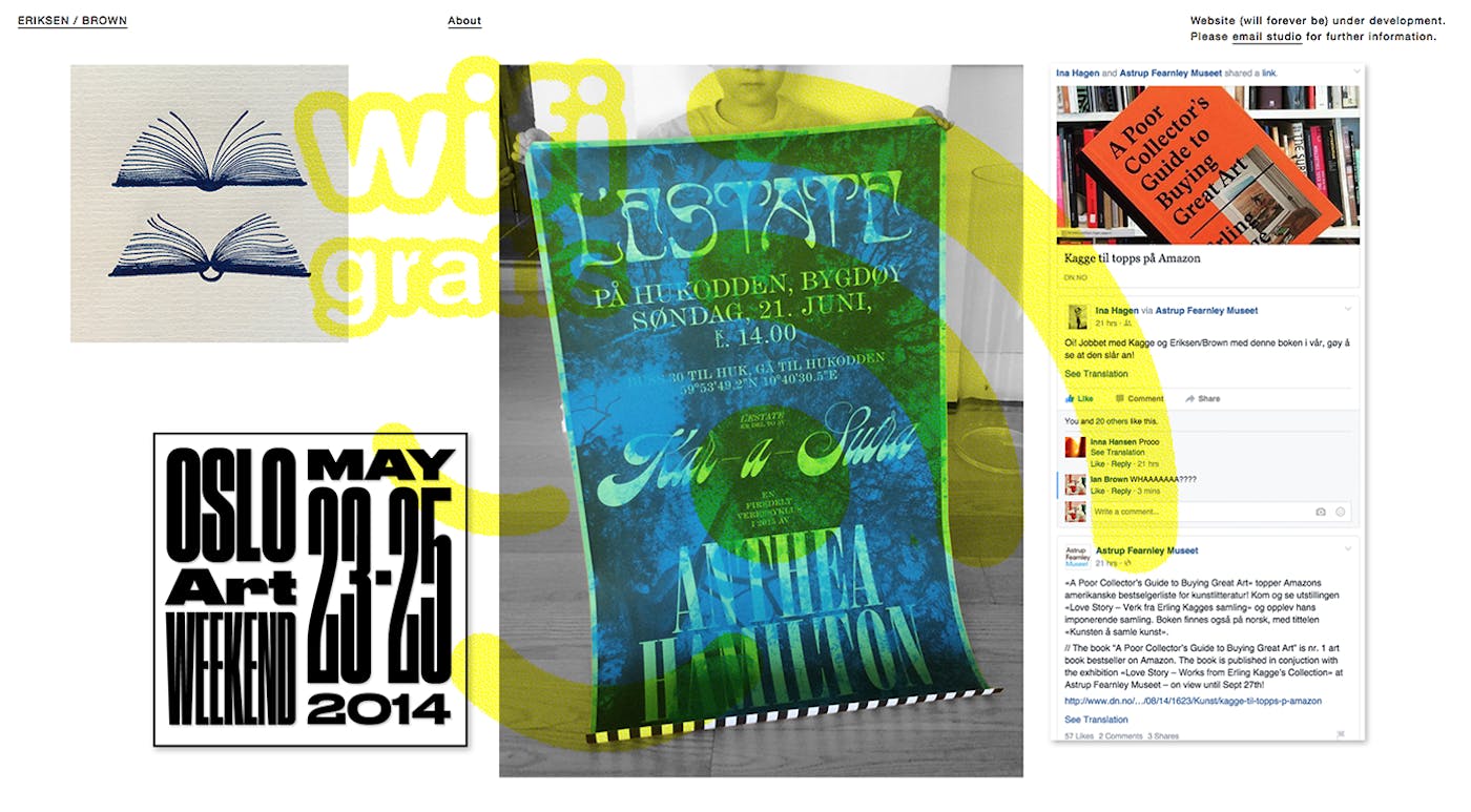
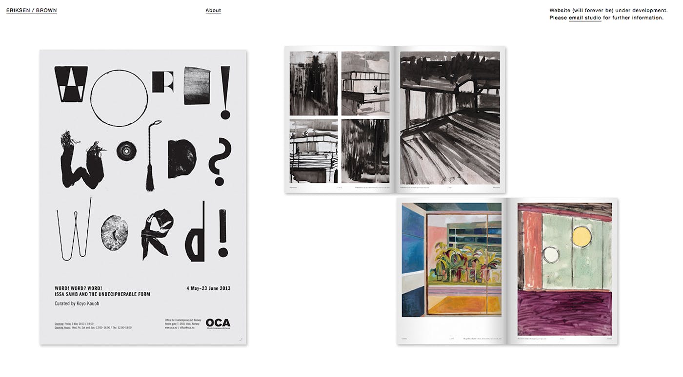
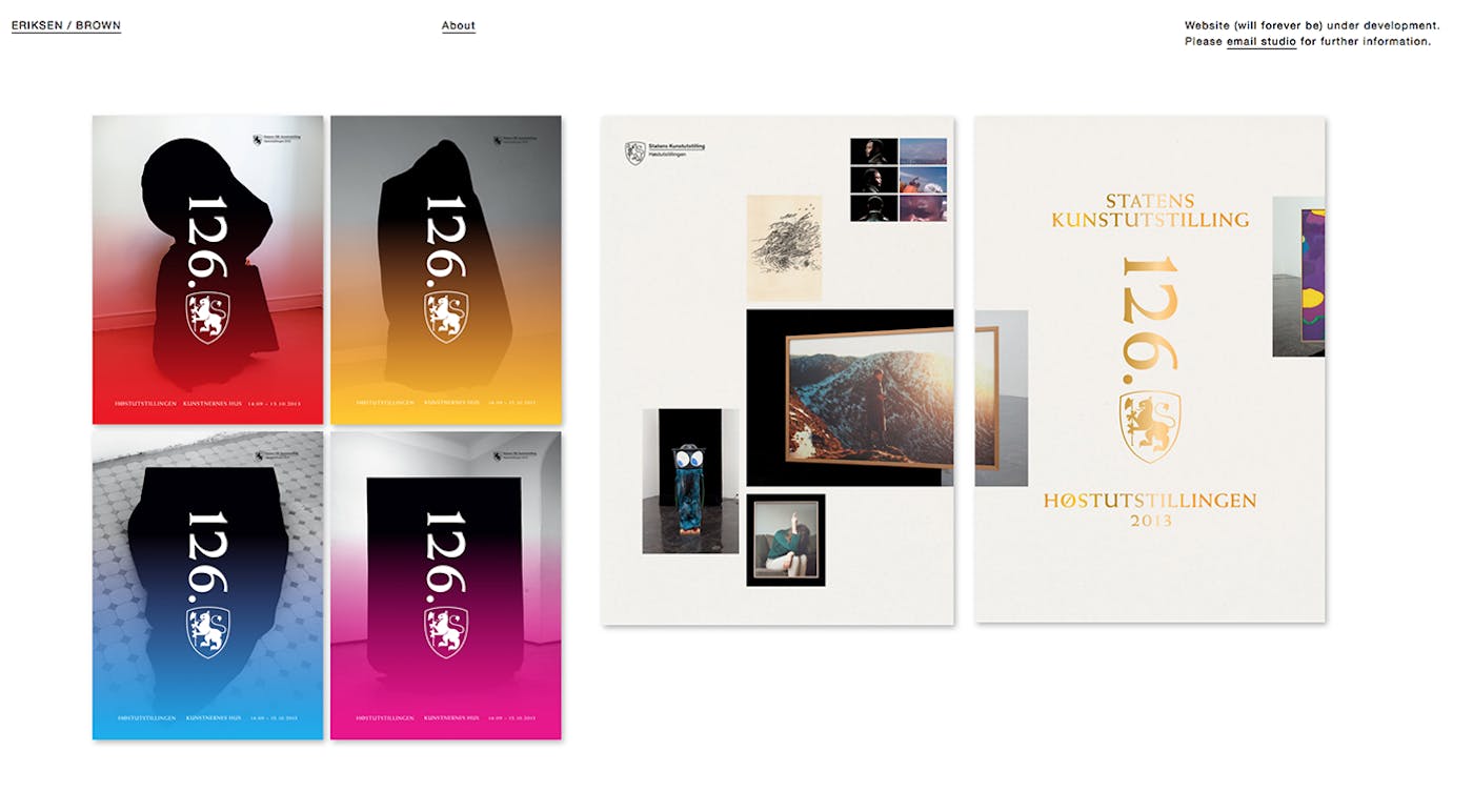
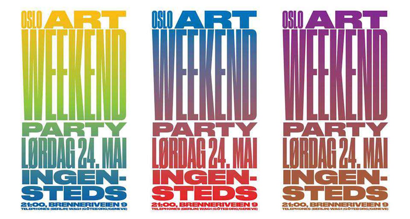
– I very much agree with the approach and aesthetics of Oslo-based Studio Eriksen / Brown. A piece of design should show a certain degree of abstraction in order to remain relevant; for me it is the quality of the visual metaphors that counts, their work manifests that kind of sophistication. The choices of cultural references, the oscillation between historical source material and contemporary contexts makes for sparkling experiences.
– Recently Oslo was plastered with their poster work for the Oslo Art Weekend 2016; I plucked quite some of those for my personal collection. As a type designer I cannot get enough of those Grotesque typefaces rooted in the 19th century, a period before the Sans-Seryph genre got moulded into the generic shapes that became iconic in this discipline.
Nevn et eller flere inspirerende internasjonalt/utenlandsk arbeid du gjerne skulle ha lagd selv.
– Keeping it close to my own activity, I want to mention the work of Cyrus Highsmith, type designer, lettering artist and illustrator based in Rhode Island (USA). His typefaces demonstrate an enormous stylistic diversity combined with a very distinctive voice - but what I am mostly fascinated with are his illustrations and sketches displayed at cyrushighsmith.tumblr.com. His shapes show an immense confidence - also, the interdependency of form and counterform is essential part of his work, something I feel very much related to and try to incorporate into my own work as a letter designer.


– In a highly stylized visual environment, another extremly refreshing approach is shown by the Swiss graphic designer SLASH letterpress printer Dafi Kühne. Make sure to watch (all) his videos, he is keeping it seriously real!
Sophie Hunger poster, av Dafi Kühne:
Hvem vil du sende stafettpinnen videre til, og hvorfor?
– I hereby pass that immaterial stick further to Benjamin Hickethier, there is a lightheartedness around his work; and as far as I can tell, he is a person of great integrity and a fellow friend of technical reproducibility.